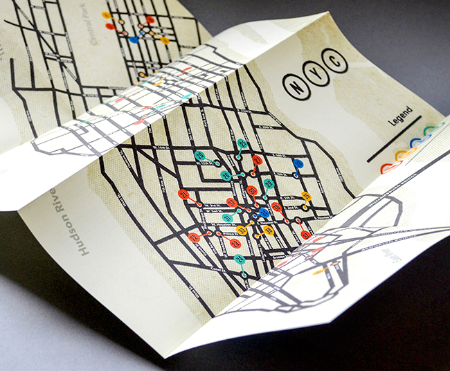
A London-based duo gives locals and tourists a unique perspective on cities in North America and beyond.

A London-based duo gives locals and tourists a unique perspective on cities in North America and beyond.
Beer drinkers can be excused for not noticing. Unlike, say, airlines, which fold their acquisitions into one big, global brand, big beer companies tend to keep the brands they buy in the market.
via Beer Map: Two Giant Brewers, 210 Brands : Planet Money : NPR.
To make a good infographic, you’ll need a little stats know-how and a little graphic design know-how. Unfortunately, as the format has exploded over the past few years, we’ve seen heaps of work from people who have plenty of the latter but little of the former–beautiful graphics that don’t really tell us much, or, worse yet, obscure the facts. What’s needed is some democratization in the other direction, tools that let people with a good grip on data create visualizations without any proficiency in the Adobe Creative Suite. Chartwell is one such example. Stately makes things simpler yet.
via Infographic: Font Lets You Make Data Maps Of The U.S., Just By Typing | Co.Design.
As a brand marketing yourself online, you understand that branding your messages is very important; how else would someone know they were your messages if they were not branded appropriately?
via [Infographic]Â 8 Great Ways to Strengthen Your Branding on YouTube – Social Media Today.
The Disciplines of User Experience Design is a mega Venn diagram by Dan Saffer (given a pretty makeover by Thomas Gläser) that explores all of the overlap between UX and other fields of design.  While other client experience elements like service design, psychology, cognitive science, and marketing are missing – you gain an appreciation for the many elements that are incorporated into the user experience process.

via Infographic: The Intricate Anatomy Of UX Design | Co.Design.